Design System Library
Complete collection of every component and variation used across the AMG Industries website. This design system ensures consistency and maintainability across all pages.
Color Palette
White
#FFFFFF
Black
#1A1A1A
Primary Green
#0E7139
Light Gray
#DDE6E1
Dark Gray
#F4F0F0
Typography
HEADER 1
Bebas Neue | Bold | 60px
HEADER 2
Bebas Neue | Bold | 45px
Header 3
Inter | Semibold | 30px
Subheading
Inter | Bold | 22px
Body light 1
Inter | Semibold | 22px
Body Regular
Inter | Regular | 22px
Body 2
Inter | Regular | 15px
Icon Library
Complete collection of all icons used across the AMG Industries website. These icons maintain consistency in style and meaning throughout the user experience.
Phone
Contact
Quality Control
Problems
Missed Shipments
Problems
Poor Responsiveness
Problems
Reliable Shipments
Solutions
Improved Quality
Solutions
Enhanced Responsiveness
Solutions
Icon Usage Guidelines
Problem Icons
- Quality Control: Issues with tolerances and defects
- Missed Shipments: Delivery delays and scheduling problems
- Poor Responsiveness: Communication and response delays
Solution Icons
- Reliable Shipments: On-time delivery and consistency
- Improved Quality: Better tolerances and processes
- Enhanced Responsiveness: Better communication
UI Components
Buttons
Button Variants
Button Sizes
All Combinations
Form Elements
Input Types
Textarea
Input States
Cards
Default Card
Basic card with default styling and clean appearance.
Bordered Card
Card with visible border for definition.
Elevated Card
Card with shadow elevation for depth.
Card Padding Variations
Small Padding
Medium Padding
Large Padding
Large Padding
Badges
Badge Variants
Logo Component
Logo Sizes

XS
SM
MD
LG
XL
Layout Components
Grid System
Grid Columns
2 Columns
3 Columns
4 Columns
Gap Variations
Small Gap
Large Gap
Flex Layouts
Justify Options
Space Between
Center
Space Around
Align Options
Center Aligned
Items End
Gap Options
Small Gap
Large Gap
Form Components
Standard Quote Form
Compact Quote Form
Section Components
Complete page sections that combine multiple UI components. Each section can be customized with different backgrounds, content, and styling options.
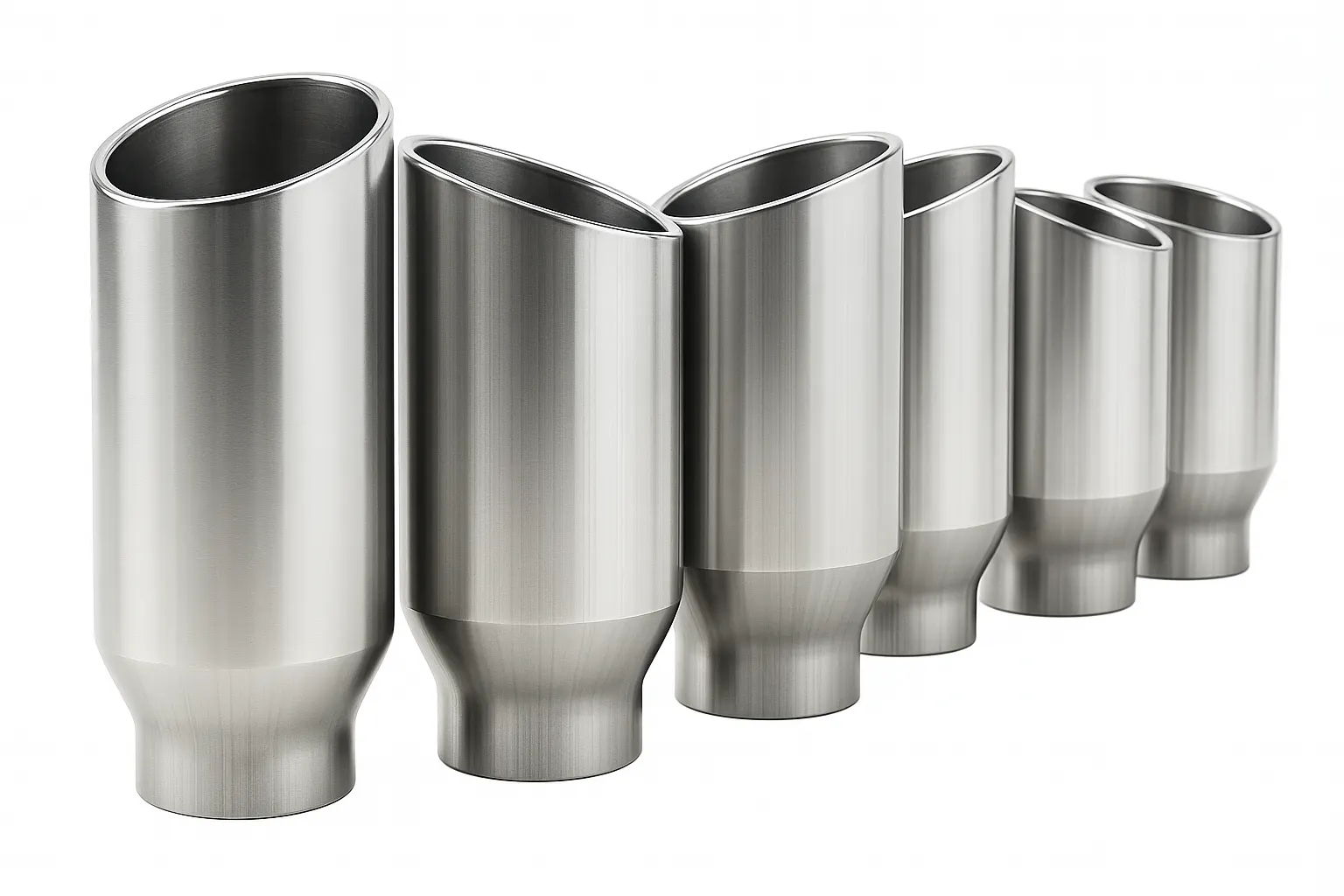
Hero Section Component
Sample Hero Section Component
This demonstrates the Hero section component with all its features including title, subtitle, CTA button, hero image, and scrolling logos.


Feature Grid Components
Icons Variant
FEATURE GRID - ICONS VARIANT
Displays features in a clean grid with icons and descriptions.
Quality Control
Rigorous quality standards ensure every component meets specifications.
Reliable Delivery
On-time delivery commitment keeps your production on track.
Responsive Support
Quick responses to your needs and requirements.
Cards Variant
FEATURE GRID - CARDS VARIANT
Same content displayed as elevated cards for more visual separation.
Quality Control
Rigorous quality standards ensure every component meets specifications.
Reliable Delivery
On-time delivery commitment keeps your production on track.
Responsive Support
Quick responses to your needs and requirements.
Simple Variant
FEATURE GRID - SIMPLE VARIANT
Clean, minimal presentation without icons or images.
Quality Control
Rigorous quality standards ensure every component meets specifications.
Reliable Delivery
On-time delivery commitment keeps your production on track.
Responsive Support
Quick responses to your needs and requirements.
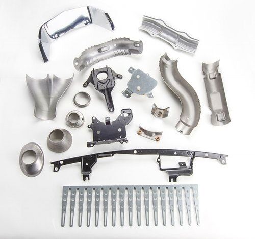
Text & Image Components
Right Image Layout
TEXT & IMAGE - RIGHT IMAGE
This demonstrates the TextImageSection component with the image positioned on the right side.
The component supports multiple paragraphs of content and flexible image positioning.
Perfect for showcasing features, company information, or detailed explanations.
Left Image Layout
TEXT & IMAGE - LEFT IMAGE
The same component with the image positioned on the left side for layout variety.
Content automatically adjusts to accommodate the image position.
Maintains consistent spacing and typography throughout.
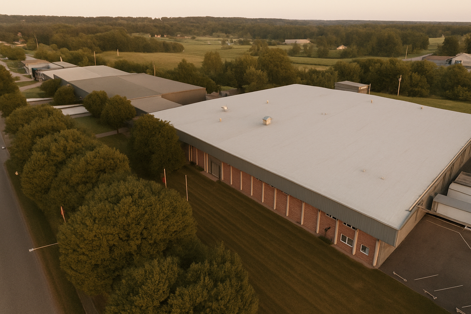
About Page Components
Specialized components for company history, milestones, and value propositions.
Stats Grid Component
STATISTICS GRID COMPONENT
Display key facts and figures in a clean grid layout with multiple column options.
Timeline Component
COMPANY TIMELINE
Showcase company history and milestones in an alternating timeline layout.
Our Manufacturing Journey
Company Founded
Established as Akron Metallic Gasket Company, beginning our journey in metal fabrication
Automotive Entry
Entered automotive market, supplying decorative exhaust assemblies to Cadillac
ISO Certification
Achieved ISO 9001 certification for quality management systems
Industry Leader
Serving major OEMs with precision metal fabrication from our Mount Vernon facility
Value Cards Component
MISSION, VISION & VALUES
Present company values in a structured card layout with flexible column options.
Our Mission, Vision & Values
Our Mission
To be the most trusted partner in precision metal fabrication, delivering innovative solutions that enable our customers' success through quality, reliability, and exceptional service.
Our Vision
To lead the metal fabrication industry through continuous innovation, advanced technology, and unwavering commitment to customer partnerships for the next 120 years.
Our Values
Quality first, customer focus, continuous improvement, and collaborative partnerships. We believe in building long-term relationships based on trust and mutual success.
CheckList Component
CAPABILITIES CHECKLIST
Display lists with custom bullet points and styling options.
Our Capabilities
- Metal Stamping & Forming
- Robotic Welding & Assembly
- Laser Cutting & CNC Machining
- Tube Forming & Bending
- Surface Finishing & Treatment
- Quality Testing & Engineering
Key Features
- ISO 9001:2015 Certified
- Over 120 Years Experience
- Advanced Technology
- Complete In-House Capabilities
Company Overview Section
COMPANY OVERVIEW WITH STATS
Combines company narrative content with key statistics in a side-by-side layout.
From Startup to Industry Leader
Our company began with a simple vision: to provide exceptional manufacturing services that exceed customer expectations. Over the decades, we have grown from a small operation to a industry-leading facility.
Today, our state-of-the-art facility houses cutting-edge technology and employs skilled professionals who are passionate about precision manufacturing.
We pride ourselves on being more than just a manufacturer, we are trusted partners who help bring innovative products to market.

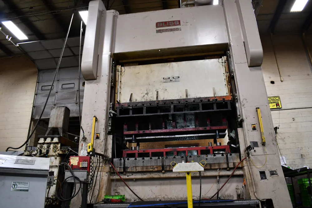
Manufacturing Excellence Section
MANUFACTURING EXCELLENCE LAYOUT
Features title/subtitle header with content sections and capabilities checklist.
Manufacturing Excellence
Our facility represents the pinnacle of modern manufacturing capabilities
Advanced Equipment
Quality Systems
Skilled Workforce
Additional Section Components
Statistics Section
COMPANY STATISTICS
Testimonial Section
"This testimonial section provides a professional way to showcase customer feedback and build trust with potential clients. The design emphasizes the quote while clearly attributing it to the source."
Client Logos Section
TRUSTED BY INDUSTRY LEADERS


Call-to-Action Section
READY TO GET STARTED?
Let's work together to bring your project to life. Contact us today for a free, no-obligation quote.
Implementation Guide
Design Tokens
All design tokens are centralized in src/styles/design-tokens.css
- Colors: Brand palette with semantic naming
- Typography: Font families, sizes, and weights
- Spacing: Consistent spacing scale
- Shadows: Elevation system
- Border radius: Consistent corner rounding
Component Structure
Components are organized by type for easy maintenance:
- UI: Basic building blocks (buttons, inputs)
- Layout: Structural components (grids, containers)
- Forms: Form-specific components
- Sections: Complete page sections
Customization
Easy customization through design tokens:
- Edit CSS variables in design-tokens.css
- Changes apply automatically site-wide
- No need to modify individual components
- Maintains consistency across all pages
Usage Guidelines
Best practices for using components:
- Use semantic component variants
- Follow established spacing patterns
- Maintain consistent typography hierarchy
- Test all component variations